

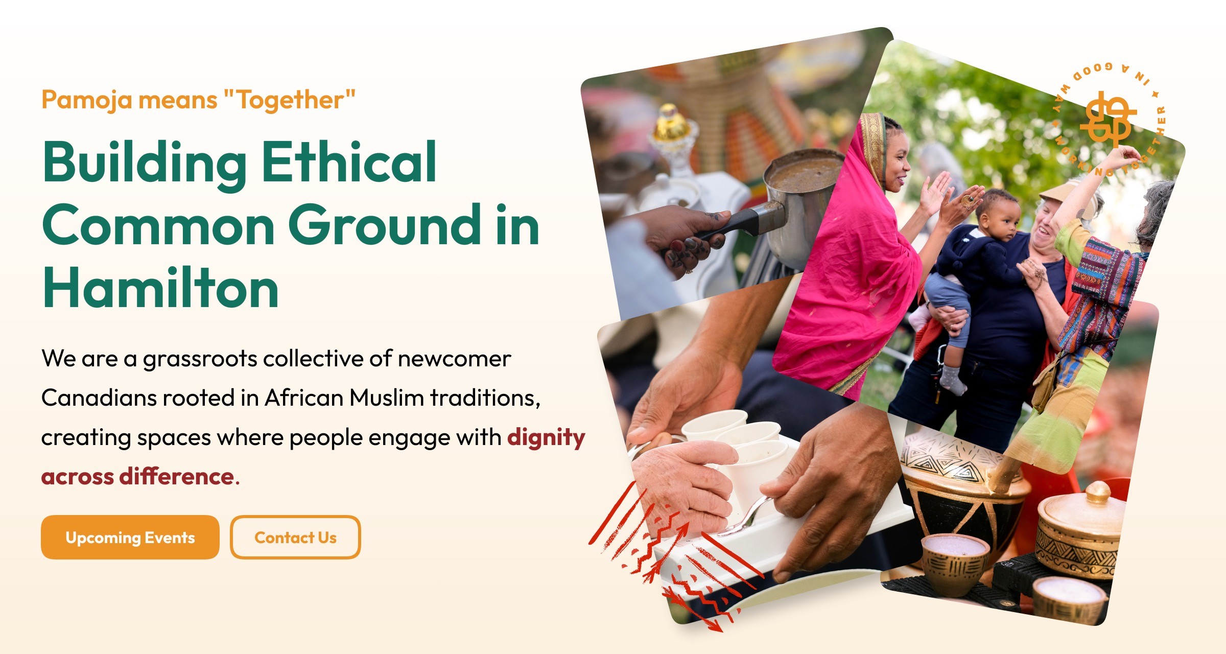
Pamoja Cultural Collective is a grassroots, community-led initiative based in Hamilton, Ontario, founded by newcomer Canadians of African Muslim origin. Rooted in traditions of hospitality, reciprocity, and ethical relationship-building, Pamoja creates spaces where people engage with dignity across difference. Their work brings together ancestral practices, treaty-informed learning, and community placemaking to transform isolation into connection.
Pamoja Cultural Collective is a grassroots, community-led initiative based in Hamilton, Ontario, founded by newcomer Canadians of African Muslim origin. Rooted in traditions of hospitality, reciprocity, and ethical relationship-building, Pamoja creates spaces where people engage with dignity across difference. Their work brings together ancestral practices, treaty-informed learning, and community placemaking to transform isolation into connection.


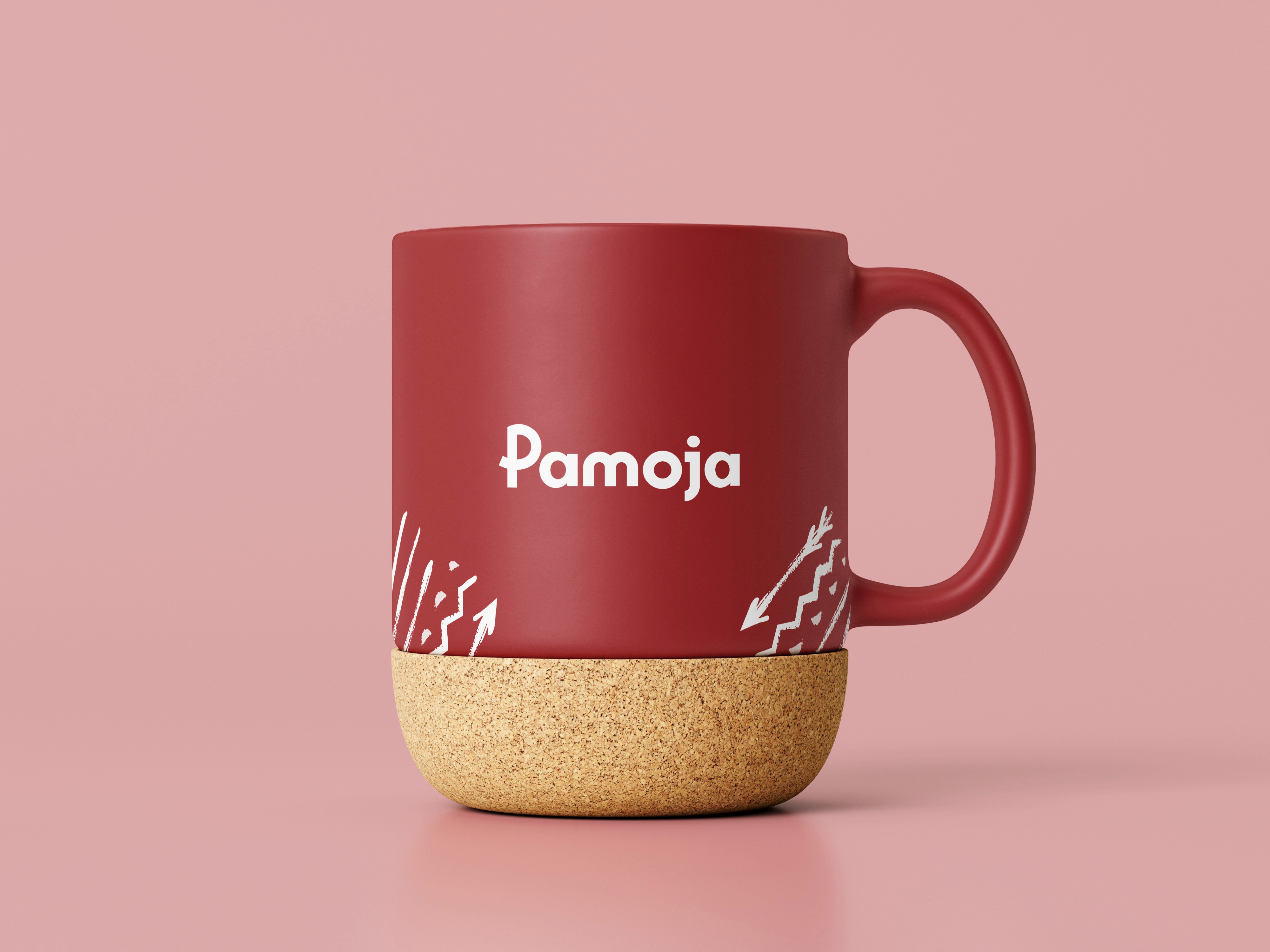
The Pamoja logo was designed to feel human, inclusive, and collectively owned rather than corporate or hierarchical. Instead of relying on rigid geometry or abstract symbolism, the mark prioritizes approachability and warmth — qualities central to Pamoja’s values of hospitality and togetherness.
The rounded letterforms and softened edges evoke a sense of welcome and familiarity, mirroring the way Pamoja gathers people through shared rituals like coffee and tea. The simplicity of the wordmark allows it to function as a unifying symbol that community members can easily recognize, reproduce, and use across different contexts — from posters and social media to mugs and event signage. This intentional restraint ensures the logo feels like it belongs to the collective, not just to the designer.
The Website
The website design focuses on clarity, warmth, and narrative flow. Content is structured to guide visitors through Pamoja’s story — from who they are, to why they exist, to how they work in partnership with others. The layout avoids heavy visual hierarchy in favor of a calm, readable experience that mirrors the collective’s slow, relational approach to community-building.
Typography, spacing, and imagery were chosen to create a sense of openness and trust. The site functions as both an informational platform and an invitation — encouraging visitors to engage, learn, and walk alongside the collective rather than simply consume content.
Next are some sections from the website, it is work in progress:
See work in progress Website

The Color Palette: "Earth, Growth, and Common Ground"
The color palette draws directly from Pamoja’s cultural and environmental context. Earthy greens, warm reds, mustard yellows, and deep neutrals reflect themes of land, ritual, warmth, and ancestral grounding. These colors reference natural materials — soil, coffee, fire, foliage — reinforcing Pamoja’s relationship to place and lived experience rather than abstraction.
The palette was designed to be flexible and expressive rather than prescriptive. Multiple color variations of the logo allow the identity to adapt to different moods, seasons, and initiatives while maintaining consistency. This approach supports the collective’s evolving nature and ensures the brand remains accessible and welcoming across diverse community touchpoints.

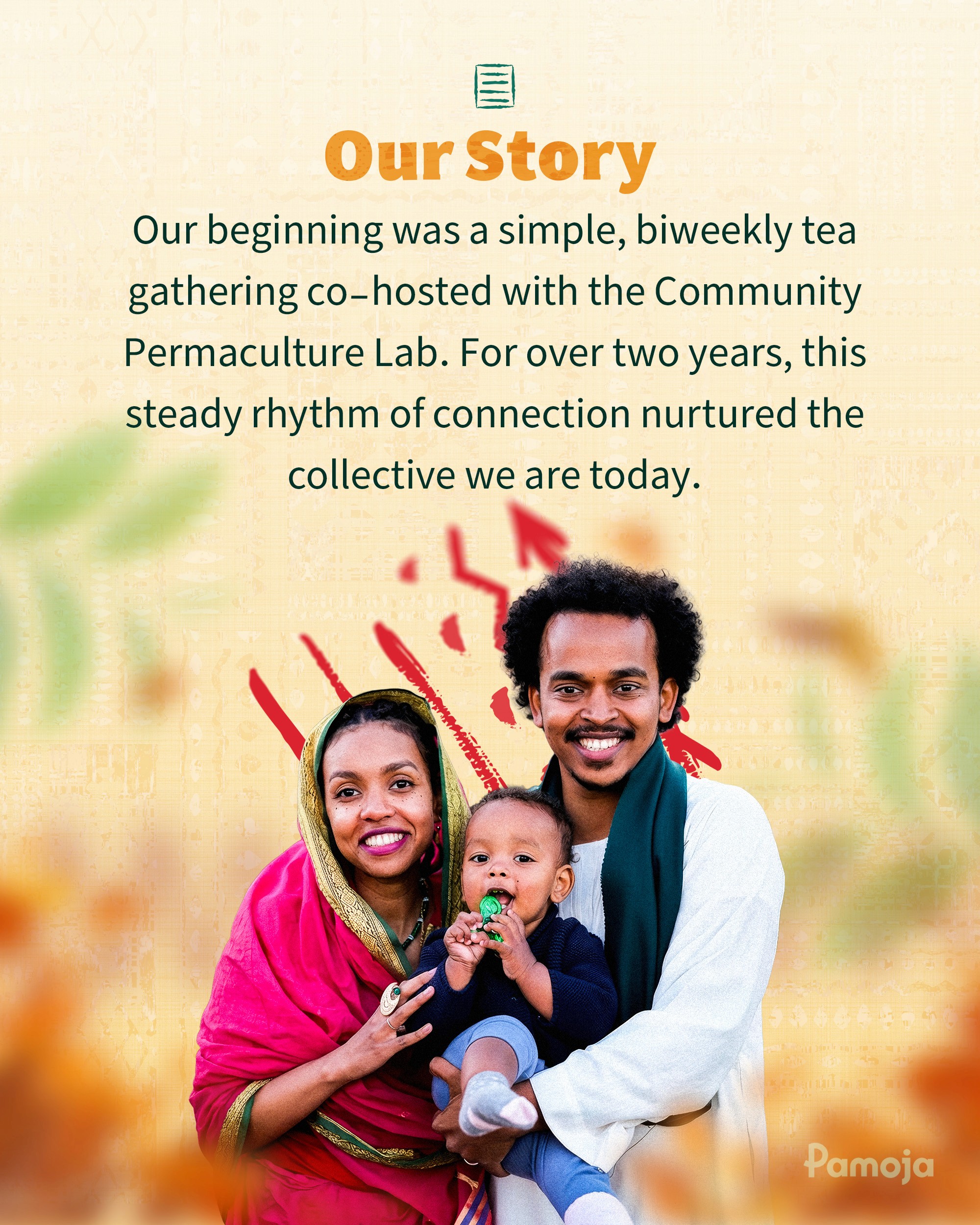
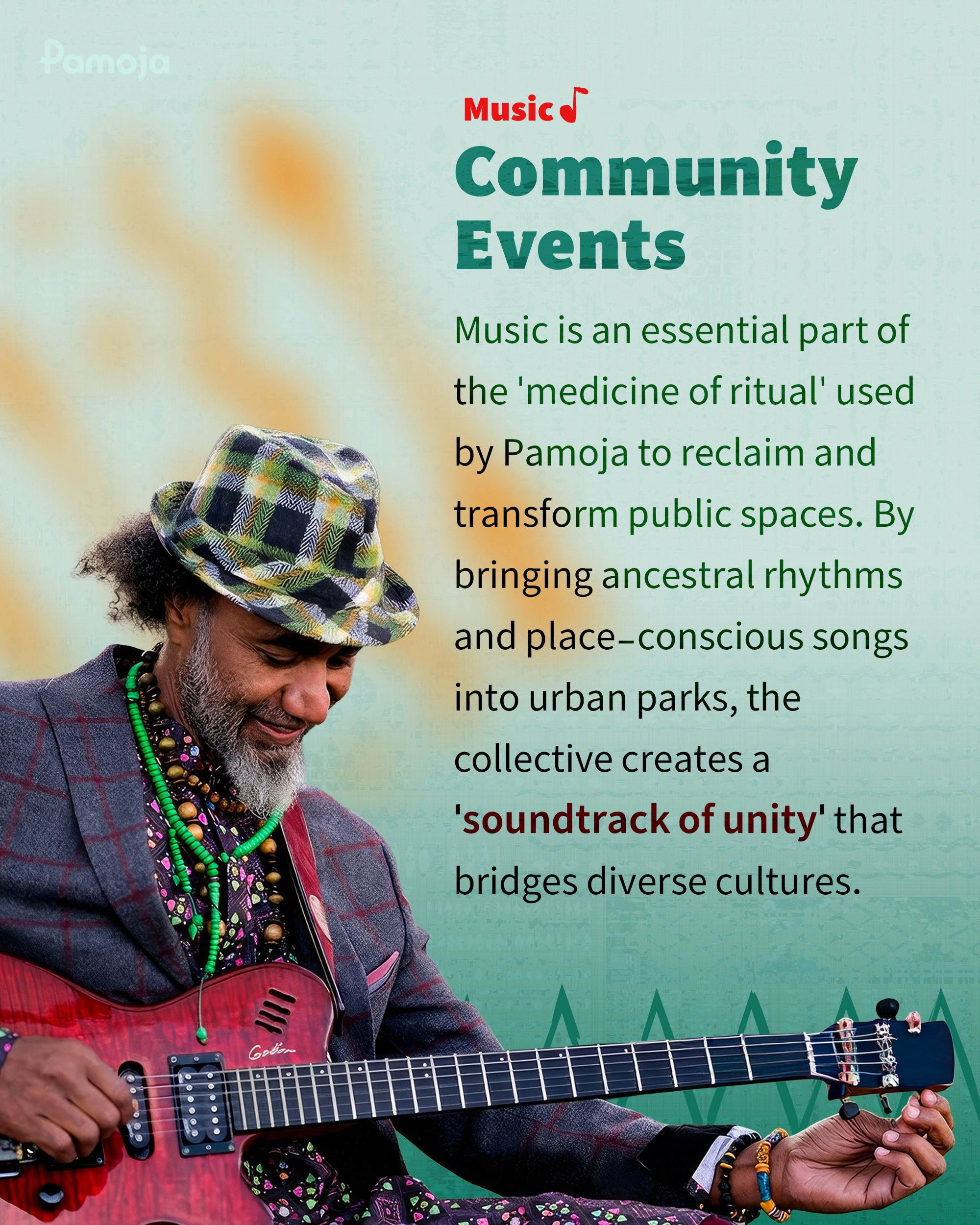
Social Media Posts
The social media visuals prioritize storytelling over promotion. Rather than polished marketing graphics, the visual system centers real moments, community participation, and lived experience. Photography, simple layouts, and warm colors work together to communicate authenticity and presence — reflecting the idea that everyone involved is a participant, not an audience.
@pamoja
@pamoja

uvant 2026©
uvant 2026©
uvant 2026©